Strawberries are probably the most pleasing fruit that is easy to eat. The other sweet fruit either have a hard outside to cut away like the pineapple, or they have large seeds in the middle like the peach or cherry. My favorite strawberries are those fresh from a garden, but I don't mind buying them in the market or tianguis and sorting through those which are too green or too ripe to find those that are soft and sweet leaving juice running down to my wrist.
This first strawberry artworks was from a few quick photos I took of a strawberry before I ate what remained of half a kilo of strawberries I had bought at the tiangus on Tuesday. After washing and sorting them, I had a large bowl which I had with a glass of white wine yesterday (Wednesday) so you see food I love disappears fast! :-)
Strawberry 1 by Christopher Johnson
I tried in this artwork to show the pleasure and sensation I had when enjoying those strawberries including that particular strawberry I photographed. The intense red contrasting with the shiny textured white of the background. The green leaves with highlights were also tempting. Does it make you want to see the large preview?
Thursday, March 11, 2010
Saturday, March 6, 2010
Autumn Delight Kaleidoscope Art
The Autumn Delight Kaleidoscope art series was inspired by one of the photos I used for my holiday themed posters and cards in my holiday greetings store at Zazzle and as posters at Imagekind. This series has a soft painterly texture and canvas feel. You can't really tell with the small preview, but if you click through and click again on an image at Imagekind, a large preview will open and that will give you a good idea.
Autumn Delight Kaleidoscope Art 5 by Christopher Johnson
This one is my favorite artwork of the series.
Autumn Delight Kaleidoscope Art 5 by Christopher Johnson
This one is my favorite artwork of the series.
Harvest Day Impasto Kaleidoscope Art
I still have to add these and the next set to Zazzle for fun gifts especially those cool ties and cards for Father's Day, but they are all at Imagekind. I'm making a few new sets of kaleidoscope artwork to celebrate my recent TBA at Zazzle for one of my Kaleidoscope ties. I didn't make a post for those but it was another series. I've always been surprised by what is (and what isn't) awarded a Today's Best Award. In any case, it doesn't really matter since I'll design, paint, draw, or photograph what I want. :-)
The Harvest Day Impasto Kaleidoscope Art is a series of geometric designs which were inspired by the colors on a photo of pumpkins resting against a leafless tree on a lawn I saw at Morguefile. While the photo wasn't so amazing, I really thought the color combination was great even though in the kaleidoscopes I didn't use the pumpkin orange. The impasto is the thick painterly texture added to these artworks. You really can see the texture in either preview, but it was added.
Thursday, March 4, 2010
Yellow Chrysanthemums 3 and 4
Yellow Chrysanthemums 3 by Christopher Johnson
Yellow Chrysanthemums 4 by Christopher Johnson
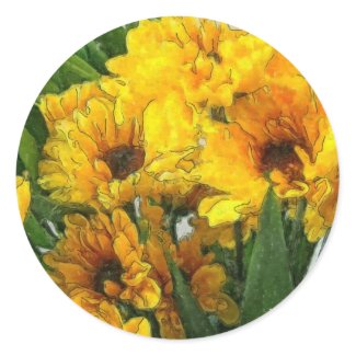
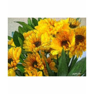
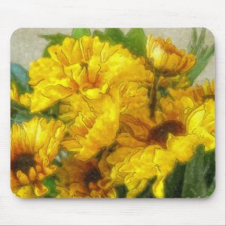
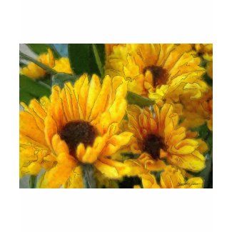
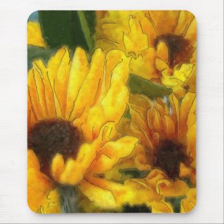
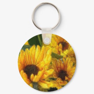
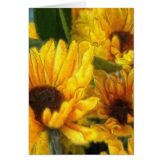
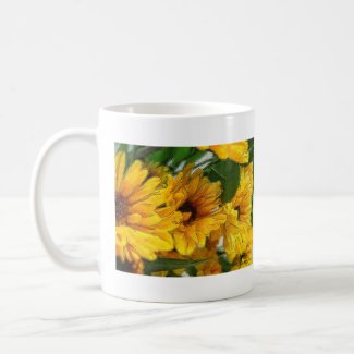
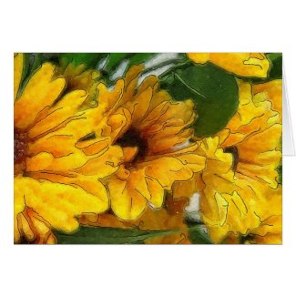
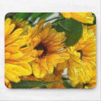
Yellow Chrysanthemums 3 & 4 were the last artworks from that set of still life photos I took to use the watercolor look. I hope you enjoyed the series!
Here are a few of the great gifts at Zazzle with these floral artworks:
Wednesday, March 3, 2010
Yellow Chrysanthemums 2
Yellow Chrysanthemums 2 by Christopher Johnson
The second in a series of yellow chrysanthemum flowers with watercolor effects. This series is also available on Redbubble and on great gift products at Zazzle (in fact most of my work is even if I don't say anything :-P ).
Here are a few of the cool gifts with this floral artwork on Zazzle.
The second in a series of yellow chrysanthemum flowers with watercolor effects. This series is also available on Redbubble and on great gift products at Zazzle (in fact most of my work is even if I don't say anything :-P ).
Here are a few of the cool gifts with this floral artwork on Zazzle.
Tuesday, March 2, 2010
Yellow Chrysanthemums 1
Yellow Chrysanthemums 1 by Christopher Johnson
I've been photographing quite a few chrysanthemums and I've been trying to do something different with the images each time. With this series, I'm working on giving the yellow chrysanthemum flowers a watercolor look in post processing. I really love how this look accentuates the petal edges and has great texture when viewed up close.
Here are a few of the products available at Zazzle with the artwork
Monday, January 4, 2010
Green Grapes 1
Green Grapes 1 by Christopher Johnson
A beautiful bunch of glowing green grapes. I enhanced a bunch of green grapes by adjusting the lighting, shadows, brightness, and color. I went through a long series of effects and reduced the level of each one. While the overall effect is powerful, each individual filter only added a little to these great green grapes.
Saturday, January 2, 2010
Christmas Tree in Forest Painting
In lesson 5 of the Learn and Master Painting course, we start by practicing with a gradient. I'm not going to bother photographing my gradient work. Then we learn how to make hard and soft edges of different types. The teacher shows many different examples of hard, soft, and lost edges and you can follow along and make your own. It is great how she takes painting step by step and I like how unlike a real class, I can go back - months later - and watch a section of the DVD painting video again.
Christmas Tree in Forest Painting by Christopher Johnson
Lesson 5 ends with the painting of an evergreen tree with other trees merging in the background. Her evergreen tree is much prettier than mine, but I guess that is to be expected. In this painting she shows us how to use negative space around objects and we continue to practice varied strokes. We also learn massing to create the tree in the middle of the work.
Autumn Tree Painting
The autumn tree painting is part of lesson 4 of the Learn and Master Painting oil painting course that I got. It is a very complete course and if you are learning to paint, want to see how another painter works, or want to get started like me coming from another medium, I recommend it.
Autumn Tree Painting by Christopher Johnson
In Lesson 4, the goal is to paint a believable object(tree with autumn foliage and shadow) and we are practicing varied strokes. In the DVD video, the teacher shows how to make varied strokes and explains how it is better to have varied strokes when painting. She also explains how edges should overlap instead of painting up to a line. It isn't clear in writing, but she shows different examples of good and bad edges so it is so easy to understand.
My problem in this case is that while I do have Burnt Umber, I didn't have Cadmium Orange for the lesson. In fact, I didn't have any orange paint at all so instead of making a trip to the art supply store, I decided to see if I could make an orange like color mixing some of the other paints! I took a simple lesson and made it complicated, but in the end, I had my autumn tree with shadow and it did have autumn colors. When I finally buy Cadmium Orange, I'll make another painting of this lesson.
I decided after finishing the tree that I wanted more than the shadow below the tree. Improvising beyond the lesson, I covered the ground with left over "leaf paint" from my palette.
Friday, January 1, 2010
Mushrooms Painting
The mushrooms painting done in acrylic is one of my favorite paintings. It took several hours to do just like it would have taken me if it were a photo manipulation.
Mushrooms Painting by Christopher Johnson
I was trying to make a realistic painting with very recognizable mushrooms however I didn't want it to be as complicated as real life would make it so I simplified the background and I only painted a few mushrooms. I gave them brown-tan-white tops and white stems. The ground was simplified to a dark brown instead of the normal leaf and twig littler you'd probably expect to find in that setting.
The trees in the background are simplified down to brown lines for branches and short wide strokes for leaves. If you are interested in learning to paint, check out the Learn and Master Painting Course. I use it at home.
Learn & Master Painting - the world's most complete video instruction course for painting
Moonrise on a Distant Planet - Robot Painting
Moonrise on a distant plant is my second robot artwork (the first was a digital drawing), and I used acrylic paint. It wasn't part of the Learn and Master Painting course that I've been learning to paint with, but I did try to practice different strokes, brush technique, and color mixing as shown in the course.
Moonrise on a Distant Planet Painting by Christopher Johnson
Unlike my previous works, I decided to first make a quick sketch outline of the robot basic shape and then I started painting over it in blocks finishing with the sky and moonrise. No, I didn't really try to keep inside the lines since the painting course doesn't show that as being correct. Instead I used my outline sketch as a guide and quite a few details changed as I worked. It was loosely inspired by a famous robot, but almost every aspect of this work is different from the robot that inspired it.
Labels:
acrylic painting,
alone,
blue,
Christopher Johnson,
distant,
far,
lonely,
moon,
old,
painting,
planet,
robot,
rusted,
rusty,
shadow,
white,
world
Winter Tree Branches and Tree Branch Study
Due to problems with my Internet provider I have several paintings to add to the blog. Enjoy!
Winter Tree Branches Painting by Christopher Johnson
As part of the Learn and Master Painting course, I had to learn how to make different brush strokes. I couldn't practice the strokes exactly as instructed since I don't have an easel I can stand in front of while painting, but I tried. I later made a more free flowing winter tree branch artwork for fun with a smaller wood panel.
Winter Tree Branch Study by Christopher Johnson
The study uses oil paint while the winter tree branches artwork is in acrylic. The colors are different in the works because even though the tubes show the same color, they are not the same. The burnt umber oil paint has a strong red tone while the burnt umber acrylic was more neutral. There is also some more variation in color because I added more white to the lighter trees in the acrylic version. I didn't feel I had enough contrast in the winter tree branches study. I am sure I will try some more of these in the future!
Labels:
acrylic,
acrylic painting,
bark,
branches,
Christopher Johnson,
learn and master painting,
oil,
oil painting,
oil painting course,
painting,
painting course,
snow,
tree branches,
Winter
Subscribe to:
Posts (Atom)